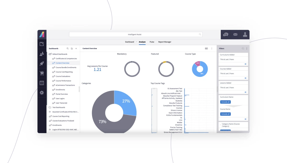
When evaluating learning management system (LMS) technology, it's not a trivial thing to seek smart design and ease of use. Smart design leads to productivity gains, goals met, time saved and money retained. That makes easy-to-use technology a business imperative if you want your tech choices to stick and be successful. Let's examine how poor user experience (UX) relates to technology failure, and how the benefits of superior UX can be measured. This will make it easier for you to justify making the move to a more usable and money-saving technology next time around.
Why Some Tech Choices Fail
Many reasons for technology failing to thrive in an organization has little to do with the technology, and more to do with how it's rolled out. Of the top 12 reasons that projects fail, according to Human Factors International Dr. Susan Weinschenk, three directly relate to the user experience:
- Badly defined requirements
- Poor communication between developers and users
- Stakeholder politics
When choosing your next LMS, know the UX pitfalls you may encounter so you can plan around them. Prioritize what's important to your group of users and administrators and gain alignment from the beginning. That way, when you go to implement, everyone has "skin in the game" and feels invested in the success of your next system.
Measuring How UX Saves Money & Time
So how can adopting an LMS with a better UX be quantitatively proven to save money? Dr. Weinschenk offers three formulas:
- Reduced Errors: (# of errors) x (avg. repair time) x (employee cost) x (# of employees) = cost savings
- Reduced Cost of Development and Maintenance: (# of changes) x (avg. hrs/change) x (cost of developer) x (4, if late) = cost savings
- Better Productivity: (time saved) x (employee cost) x (# of employees) = cost savings
Taken together, these equations offer a clear way to measure how a better user experience translates into time and money saving efficiencies for your organization. It's like found money, and will increase the likelihood that you'll avoid a poor choice in your LMS solution.
Which LMS Features Elevate UX?
Now that we've established the importance of user experience in your next LMS solution, here are ten features to add to your LMS requirements list that directly impact user experience:
- Attractive and well laid-out interface
- Understandable dashboards, with easily accessible buttons, menus
- Contextual displays, including for roles, that present action options when needed and hide when not relevant
- "Set and forget" automation—with customizable rules—to reduce manual work
- Multilingual capabilities for both the user interface and the administrator backend
- Brandable interface, so you can make the UI look like the rest of your network systems
- Bold data visualization so metrics are easy to find and understand
- Solid performance so your system is available when you need it
- Security safeguards that are effective without overly intruding on UX
- Proven content; this will directly impact how users engage—or fail to
Training is designed to enhance employee value, but that fades if no one can figure out how to use your system. Choose wisely, remembering the importance UX plays in your ultimate success, and your LMS will be the asset it's designed to be!
If you're in the market for a learning management solution—designed with humans in mind—then give Absorb LMS a look. Take a tour on your own, or reach out so we can show you how its design and user experience will make your training shine.


